The problem I found by not looking for it
This project didn’t start with a brief. It started with a conversation.
I was talking with engineers from other app teams about something completely unrelated when I started noticing something odd. They kept mentioning “their” version of the assistant — how it worked in their app, what it could do, how they’d built it. It gradually became clear that across the company, the same component had been implemented in entirely different ways.
The AI Assistant chat panel — meant to be a consistent companion across all C3.ai applications — had fractured into at least half a dozen different versions. Different layouts. Different behaviors. Different interactions. Same idea, unrecognizable implementations.
Always reach beyond your direct team. The most important problems are often visible only from the edges — in the gaps between teams, not within them.
Audit snapshot: the same component, implemented multiple different ways
Consistency isn’t a nice-to-have. It’s infrastructure.
The divergence wasn’t born from carelessness. The original component had been built under a tight deadline by another team, without sufficient consideration for interaction depth, edge cases, or future extensibility. It worked for the moment. Then every team built their own thing on top of it.
- Users experienced the same product feature differently depending on which C3.ai application they were using — the assistant felt like a different tool every time.
- Engineering effort was duplicated across teams: each one maintaining their own version, fixing their own bugs, implementing their own new capabilities.
- As AI capabilities evolved rapidly, there was no shared structure to absorb them. New features landed inconsistently — or not at all across products.
- Brand coherence was at risk. For enterprise clients, product polish is a signal of platform reliability. Fragmentation was starting to read as immaturity.
Design systems work is social work
Once the need was clear, I organized a recurring working session with designers across application teams. Not to present decisions — to discover them together. Every designer brought use cases from their context that I hadn’t considered. Every conversation surfaced edge behaviors that needed accounting for.
It was one of the best collaborative dynamics I’ve worked in. Nobody owned the problem alone.
Mapping existing behaviors across multiple app versions
Weekly sessions: surfacing use cases from every app team
The harder part wasn’t the design — it was adoption. Each engineering team had already built something. Asking them to rebuild introduced real friction. I spent significant time working alongside developers: explaining why consistency mattered at a system level, being specific about what “standardize” meant in practice, and identifying the smallest viable changes that would still move the needle.
This is the part of design systems work that rarely shows up in portfolios: the diplomacy. Getting people to care about consistency requires understanding what they care about first.
Building from the ground up, the right way this time
I rebuilt the AI Assistant chat panel component in Figma from scratch — not cosmetically, but structurally. The goal was a component that other designers could extend confidently and engineers could implement consistently. That required making every decision explicit.
Token-based architecture
Every color, spacing value, and typography style references the design token system — not hard-coded. Changes at the token level propagate automatically, keeping the component aligned with the broader design system as it evolves.
Variant coverage for every state
Empty, loading, responding, error, expanded, collapsed — every state the component could find itself in was accounted for and designed, not left to interpretation. Edge cases are where inconsistency hides.
Toggle and selector logic for reusability
Component structure was organized around how designers would actually use it: clear property controls, sensible defaults, easy customization for app-specific variations without breaking the shared foundation.
Documented specification for engineering
A written spec accompanied every component: behavior descriptions, animation timing, edge cases, and implementation notes. The spec turned design intent into something engineers could build against without ambiguity.
Component anatomy: tokens, variants, and property controls
One component became a small ecosystem
As new AI capabilities rolled out, the AI Assistant chat panel couldn’t be the only component carrying the weight of the assistant experience. The standardization work uncovered a wider gap: assistant-adjacent components — file attachments, quoted content, and AI reasoning states — were also inconsistent.
I extended the initiative into a small but structured assistant component library: a focused collection designed specifically for AI interaction patterns, documented and maintained as a living resource for product teams.
I became the go-to person on the team for any question about the assistant’s design behavior. When someone was building something new, they came to me first. That wasn’t a title — it was a signal that the work had created real clarity where there had been confusion.
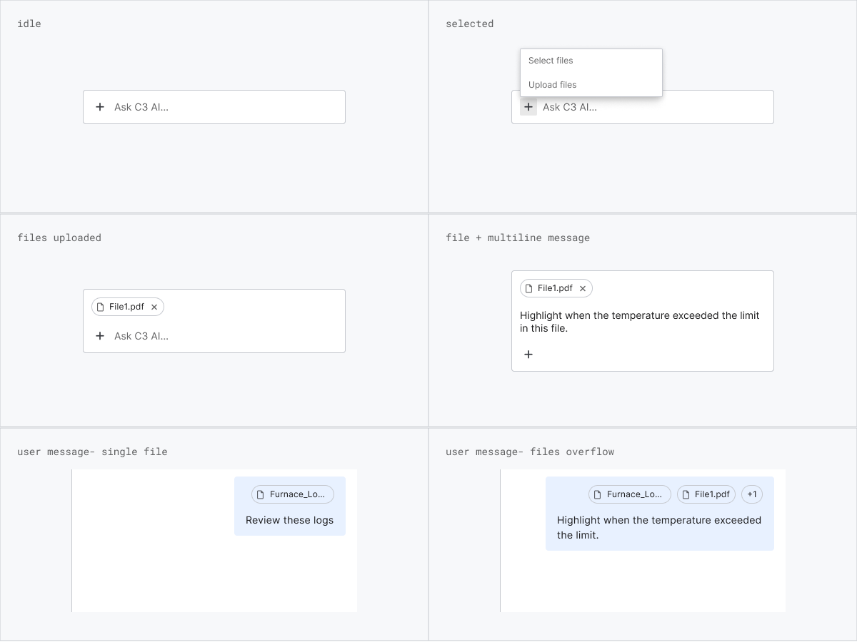
Attaching files
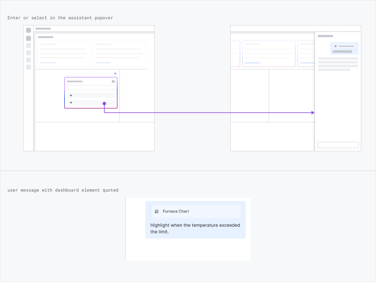
Quoting content
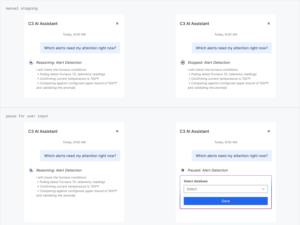
Reasoning
Consistency as a product decision
- Established a unified interaction model for the AI Assistant chat panel across all C3.ai applications, eliminating the visual and behavioral fragmentation that had built up over time.
- Created a scalable component structure that absorbed new AI capabilities as they shipped — no longer requiring each team to design their own solution.
- Reduced engineering duplication and improved handoff quality through a shared specification that engineering teams could implement against directly.
- Built a small assistant component library extending the standardization to AI-specific interaction patterns across file attachments, quoted content, and reasoning states.
Design systems are inherently social. The best component in the world doesn’t matter if no one uses it. Consistency isn’t built through enforcement — it’s built through alignment, empathy, and making the right path easier than the wrong one. To be a great design systems designer, you have to be a great product designer first.